
14th September 2020
Creating photorealistic renders has been an obsession for artists in architectural visualisation for as long as we can remember. While photorealistic renders have been possible for many years, recent advancements in processing technology and rendering software have made photorealism an easier goal for any 3D artist.
Here are 11 tips to help you achieve a higher level of photorealism in your next 3D renders.

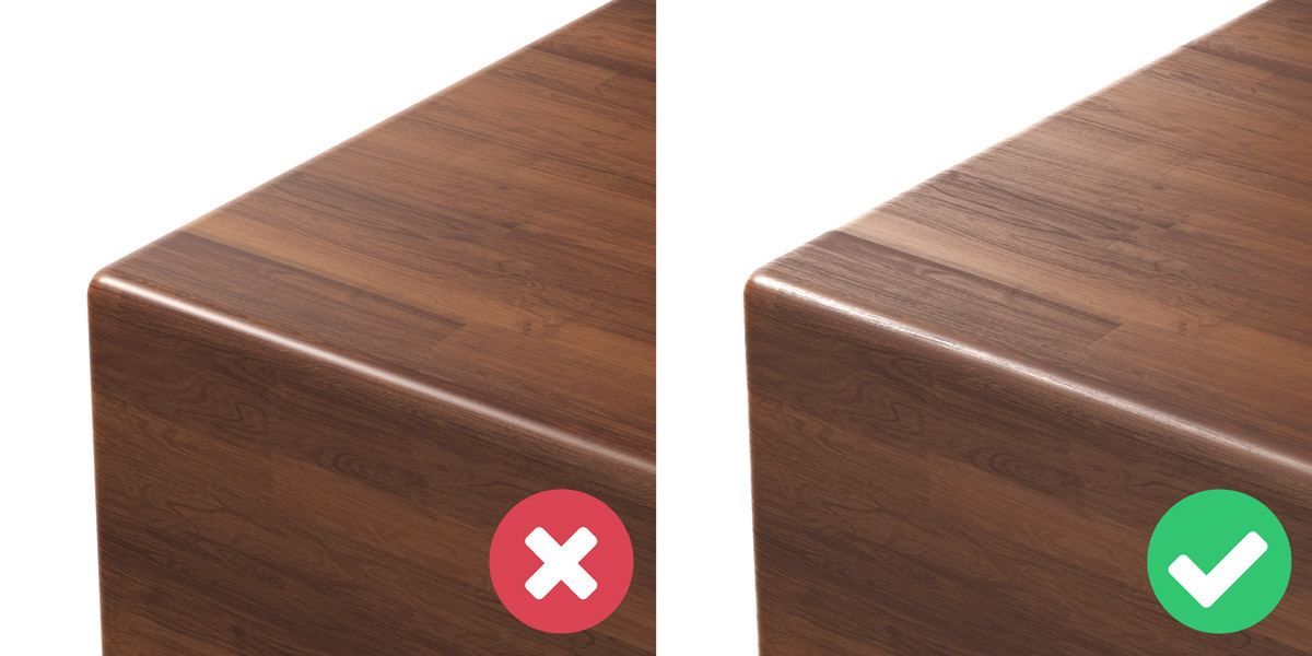
A simple one to start with – round your edges. It surprises me how frequently I see this rule broken. There are so many impressive architectural renders that still use geometry with sharp edges. Perfectly sharp edges do not exist in real life, and should not exist in 3D. Rounded edges improve the way that light and reflections affect an object and give smoother more natural highlights.
There are various techniques to achieve this. The most common in 3ds Max is to chamfer the edges with the chamfer modifier. If you use this technique make sure to:
Another technique is to add supporting edges and a turbosmooth modifier. This will create rounded edges and, in some cases, a more realistic result. We rarely use this technique as it is slightly more time consuming, creates additional geometry and in most cases the differences are negligible.
If you use this method, consider adding a chamfer modifier with the tension set to 1.0. It is much faster than manually creating supporting edges.
The final technique is to round the edges using a material instead of geometry. It works by adding an edge texture (CoronaRoundEdges or VrayEdgesTex) to a material’s bump slot. This is an interesting approach and it is very fast. But as it does not create additional geometry, edges can still appear sharp issues at intersections.
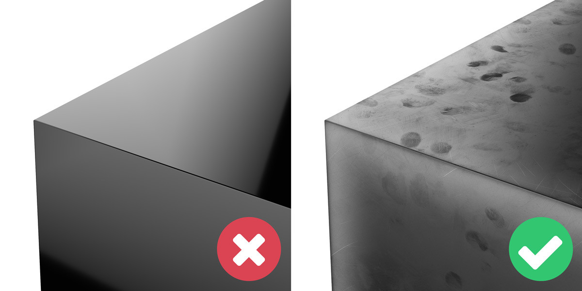
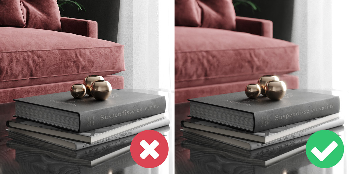
Take a close look at any surface around you in the real-world. You will notice dust, smudges, scratches, dirt and various other imperfections. Yet in 3D, most artists create their materials without attempting to replicate these effects. By using imperfections that make sense in the context of your scene, you can add another level of realism to your renders. For example, variations to a wooden floor caused by years of use and cleaning, or a fingerprint texture that simulates the oily residue left on a smartphone.
The most common way to introduce these imperfections is by using a material’s gloss channel. This technique closely mimics reality as it changes the sharpness of reflections throughout a material. In most cases, this is a subtle effect but that is what we are aiming for. Clients typically will not appreciate you adding muddy footprints all over the lovely wooden floors of their new build apartments. Subtlety is key.
Another great way to introduce imperfections to a material is to simulate edge wear. Edge wear is when an object has a greater degree of wear on its edges than flat surfaces, causing a difference in appearance. This change in appearance is most commonly caused by scratches on painted, polished or varnished materials, causing the loss of the additional coat and exposing the raw material underneath.
Edge wear can be simulated in 3D by using a layered material, and a combination of imperfections and edge textures (CoronaRoundEdges or VrayEdgesTex) as a mask. This technique gives you control over the different materials and where they are applied.
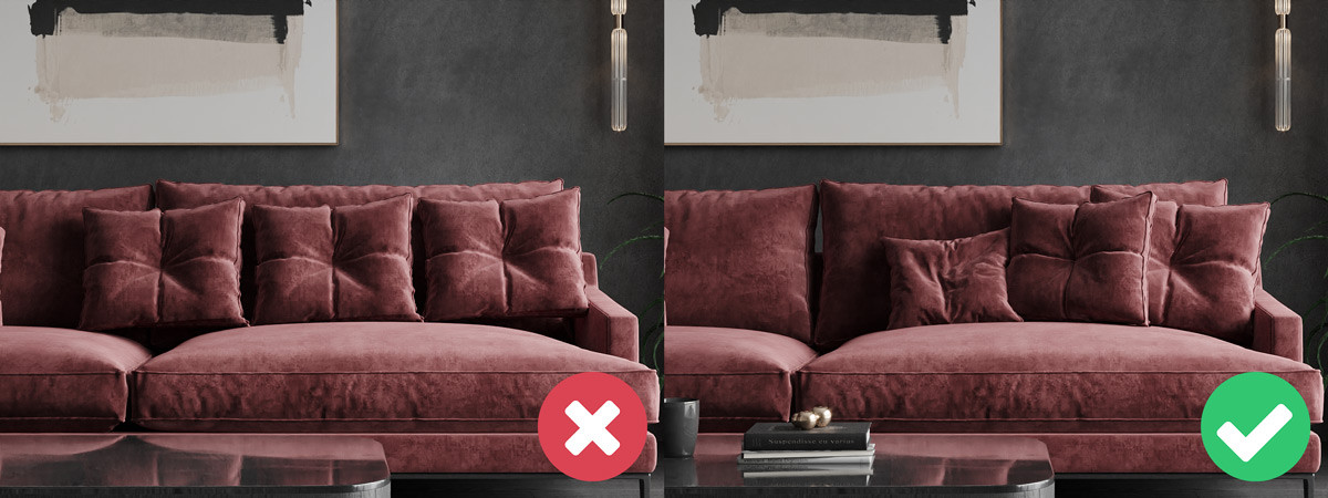
Following on in a similar vein from the previous tip, a failure of many 3D renders is that they look too perfect. That is why we suggest adding some chaos and randomisation to your scene.
Think about how unusual it would be in reality to see cushions on a sofa, all perfectly spaced apart, at the same rotation and even with the same creases. This is easy to do in 3D, but in the real-world, it is not possible. Make sure when you are duplicating an object to add some variation to it, rotate it and scale it up or down. A great way to randomise the transformations of objects is with a script from Neil Blevins’ SoulburnScripts aptly named transformRandomizer. This tool allows you to change the position, rotation and scale of any number of objects by a random amount.
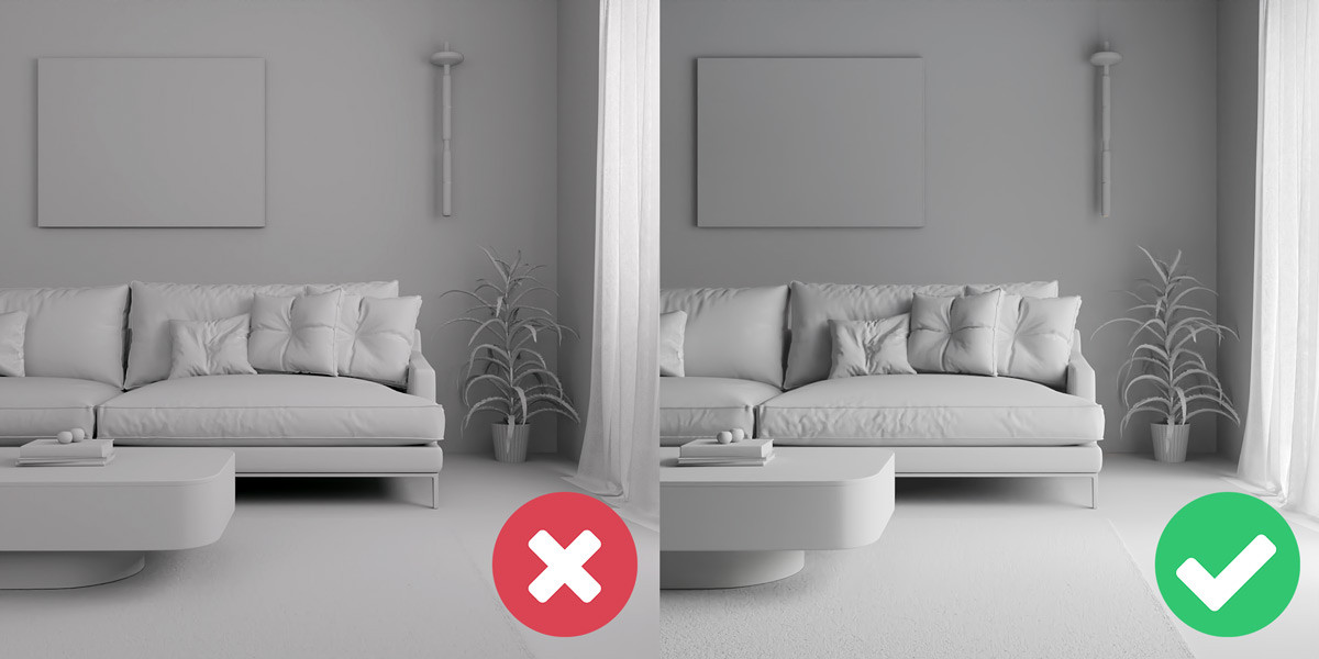
Adding variety in the geometry of 3D models can be a little more complex. But is just as important, particularly for natural and organic models where every object is unique. A quick and easy way to do this is by simply adding a noise or FFD modifier. This method can sometimes look more natural by using a large soft selection and only modifying part of the geometry.
But why stop there? Let’s introduce some variety into the materials. Subtle variations are very common between objects of the same material, particularly in nature. When was the last time you saw a lawn of grass, where every blade was the same shade of green? Never, right? So, make sure to use the CoronaMultiMap (or similar) to some randomise the hue and gamma of your textures, or to introduce an entirely new texture.
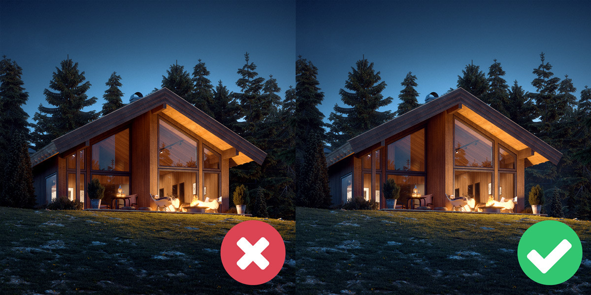
A dead giveaway that a many CGIs are fake is the lighting. If you want to achieve photorealistic renders, it is best to mimic the lighting from real-world environments. Now you still have some creative license here. After all, one of the biggest benefits of 3D rendering is the freedom that a scene does not have to be physically possible. But basing lighting setups in reality makes viewers sub-consciously interpret a CGI as more believable.
The best way to create a physically accurate lighting setup in 3D is to first identify all of your light sources. Think about their positions, shapes, colour temperatures and intensities. Once you understand these you can recreate them in 3D, attempting to mimic reality. Interactive rendering and light mix (in Corona and Vray) are both incredibly useful during this stage, the instant feedback allows you to experiment with different values and perfect your lighting much faster.
Sometimes it can be difficult to identify the characteristics of a light. This is because our eyes adapt to different situations, changing how we perceive them. Consider that you are outside of a building with the sun beaming down. The interior lights are on, but they are virtually imperceptible as the intensity of the sun overpowers them. Yet, fast-forward to night-time and these interior lights appear much stronger and emit a warm tungsten colour, in contrast with the dark blue night sky. Going inside the building, these same lights lose the orange tint and appear whiter. The characteristics of the interior lights did not change, only our perception of them.
Here is some guidance on light temperatures:
Last few notes on lighting - do not be afraid of shadows. They are a great way of introducing contrast and can be used as a compositional element to guide the viewer to your focal point. A lot of beginner artists use large area lights or ambient lights, avoid these, as they destroy shadows and do not work like any light sources in reality.
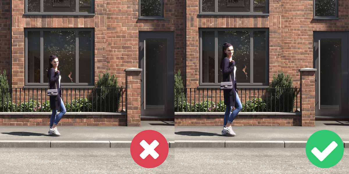
Along with a physically-based lighting setup, use a camera angle that is also physically possible. There are situations where it makes sense to break this rule. But generally, try to keep your camera between 50-170cm above the ground, or high enough that it could be a drone or helicopter shot. As humans we are not used to viewing the world from more than 2 metres off the ground, so the perspective from these heights can make viewers feel uncomfortable.
As for the focal length, try to keep it between 16-50mm for interiors and 30-100mm for exteriors. Next time you are setting up a camera, instead of just placing it in the corner of a room with a wide-angle lens, experiment with different compositions and by cropping in to focus on the details.
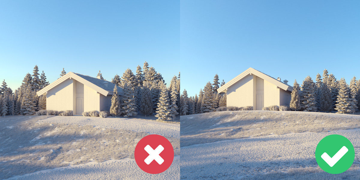
Not only does some subtle atmospheric fog make most exteriors look more realistic but it also helps with the composition. Lowering the contrast of the background creates a greater sense of depth. But much like many of the other tips here, subtlety is key. Overdoing it by adding a thick layer of fog to a sunny midday exterior will have the complete opposite effect.
There are two different approaches for creating atmospheric fog to use depending on the scenario. The first is to use a volume material such as the CoronaVolumeMtl and place it in the global volume material, under the scene tab in render settings. Experiment with the absorption distance to change the intensity of the effect. If you use multi-pass compositing, include the volumetrics render element to give you control of this effect in post-production.
The other method is to use the z-depth render element. It is simpler but, in our opinion, does not yield as realistic results. Z-depth is black and white render pass that gets progressively darker further away from the camera. Invert, tint and composite it on top of a beauty pass, using the additive blending mode, for quick atmospheric fog.
Photographers try to remove lens effects such as bloom and glare as much as possible, but in 3D when they are used subtly, they can increase the realism of a render. Be careful, using too much can be an instant giveaway that an image is a render. Take a look at photographic references and use these as guidance.
Both Corona and Vray handle bloom and glare in the frame buffer. You can adjust it during rendering and after it has finished.
When used effectively, depth of field adds a level of realism to 3D renders. Keep in mind that in photography the depth of field becomes shallower (creating a stronger effect) the closer a subject is to the camera. So, we recommend using it on close-up detailed shots as a way to draw attention to your focal point. Enable depth of field in the camera, or do it in post-production with a z-depth pass and the lens blur filter in Photoshop.
One of the easiest ways to tell that a render is fake is incorrectly scaled objects. This is particularly true for elements that we see every day, such as, people, cars, furniture and architectural elements. So, set your units to a measurement that you are comfortable with (for us that’s centimetres) and when you create or import a model double-check that the scale matches up with the real-world.
Here are some standard dimensions of common objects to give some guidance:
This obviously is not an extensive list. So, if you are working with an object that is not listed above, give it a Google.
It is not just the scale of objects that you need to be aware of but also of textures. Take time to make sure that objects UVs and material tiling are set to accurately represent the scale of the real-world material. While you are at it check that the orientation of the texture is correct and that it is not repeated or tiled. If you do have a texture that is noticeably repeating, you can replace it with a larger texture. Or if this is not an option, another technique is to copy it, offset it and use a noise map to mask it over the original texture. This will create more variation and prevent textures for appearing tiled.
PBR or physically based rendering is a methodology that aims to more accurately represent the behaviour of light and how it interacts with surfaces in reality. If you are aiming for photo-realistic results, understanding how to create PBR materials is a must. The main principles revolve around setting up the diffuse, reflection and IOR of a material to represent its real-world characteristics. The rules differ for metals and non-metals (dielectrics).
Here are some simple rules for creating non-metal PBR materials:
And for metal PBR materials:
For more information on this, Corona Renderer has a video on YouTube where they create lots of common materials using these PBR principles.
What better way to make a render look more photorealistic than to use photos? Now, this may sound like cheating but it is not at all. Our favourite way of doing this is by compositing 3D exterior renders of buildings over the top of a photographed backplates, to show proposed buildings in pre-built environments. One of the main reasons this technique works so well is because it forces the artist to match up the lighting and perspective to an actual photograph.
Other examples of photos you can use during compositing are people, landscapes, grass, skies, etc. Just make sure that the perspective and lighting of the photos match the render.
Along with using photos during compositing, we recommend using photographic references throughout the entire visualisation process. They can be inspiration for creating the right mood, compositions or colour grading, and they also help to ensure that materials and lighting look correct.
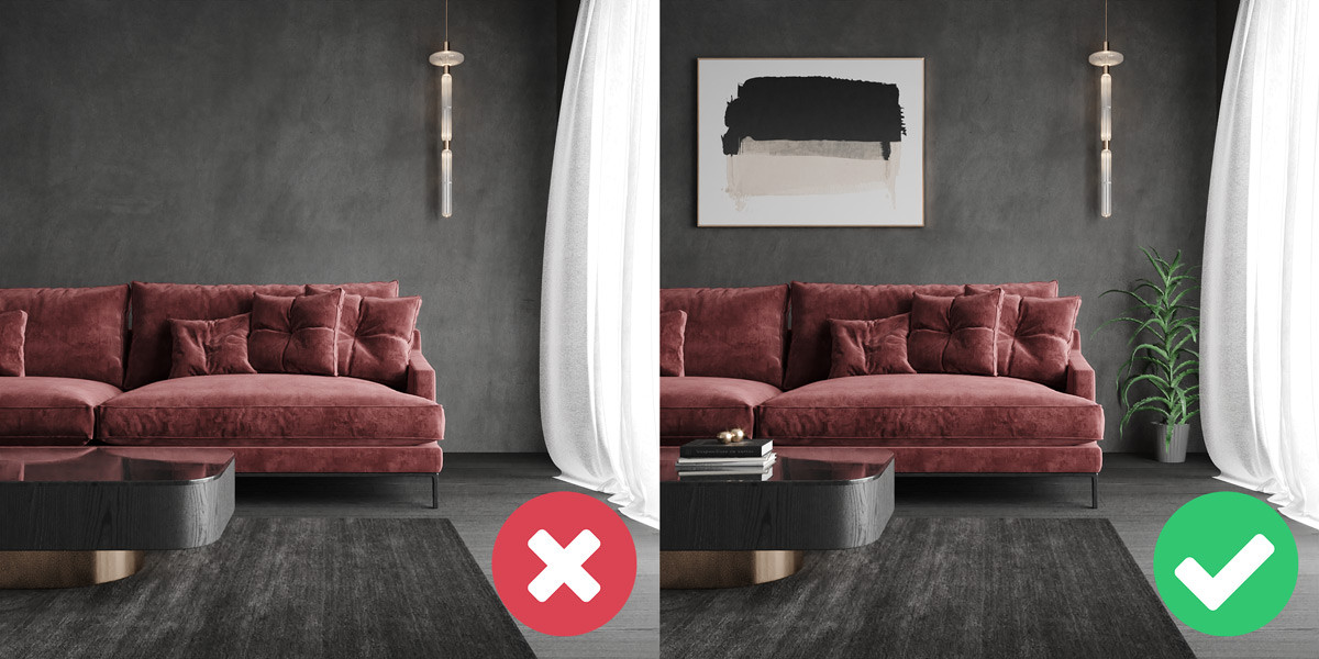
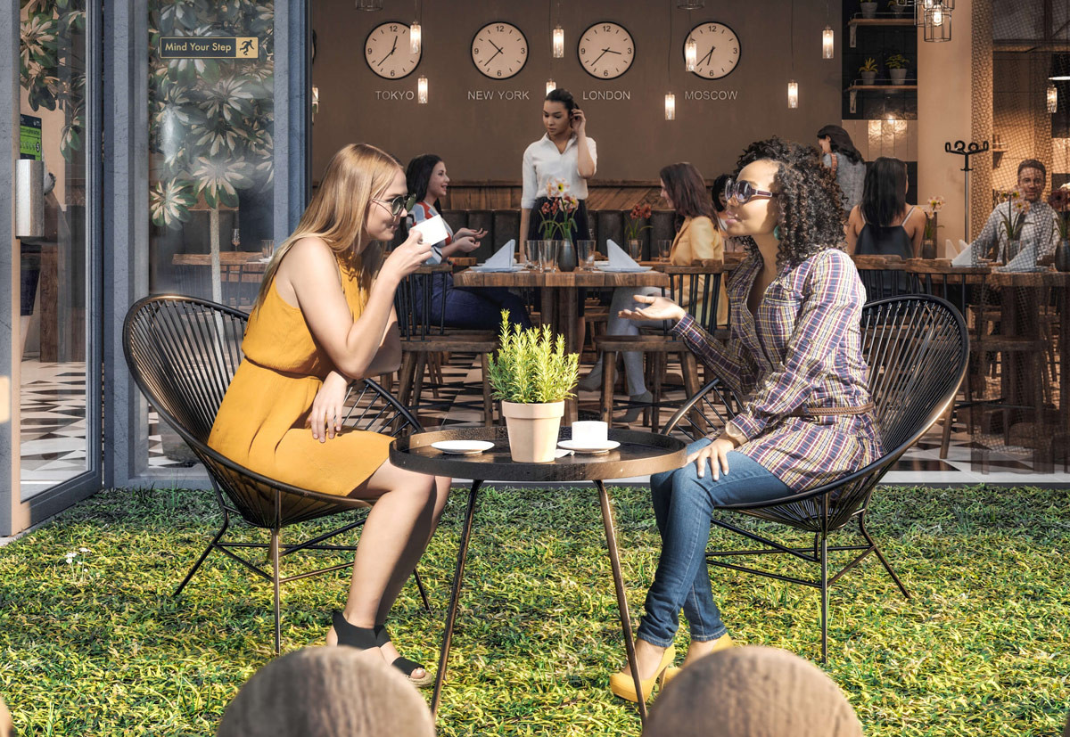
Our last tip is to - pay attention to the details. As we talked about earlier, surfaces in reality are never perfectly clean. Take some time to look around you and try to find imperfections and details that exist in the real-world but not in your renders. Do your interior renders have light switches, plug sockets or a fire alarm on the wall? Do your exteriors have road markings, manhole covers or dead leaves gathered up by the kerb? If not think about incorporating these extra little details, they could make a big difference.
We hope this post gives you something new to try in your next set of architectural renders and helps you elevate your work to the next level. It is the goal of many architectural visualisation artists is to create renders that are indistinguishable from photos. While it is a perfectly valid goal, photorealism is only the beginning. Just because a render looks photorealistic it does not necessarily make it a great render. There are other important factors, such as, the story that it tells and how it makes the viewer feel. We are going to talk about other ways to improve your architectural renders in the future. As well as taking a detailed look at colour and composition and the important role they play in architectural visualisation. So, keep an eye out for future posts!
Let us know what you think! Would you like to see more content like this? Or have you got a question for us? Either way, we look forward to hearing your thoughts and continuing the discussion.
Alternatively, if you want to talk about career opportunities, discuss an upcoming project, or just say hi, we would love to hear from you too!