18th May 2021
Whether you’re working on renders for your own home, an office, or any other space, you need to immerse yourself in the details of the interior design. To make inspiring interior renders that stand out, you need to pay close attention to everything from the interior design styles and materiality to the colour combinations and lighting.
Interior design is an essential part of the interior rendering process.
Still, surprisingly many newcomers to the visualisation field choose to pay little attention to it and instead focus solely on modelling and other technical 3D skills. Although these skills are important in their own right, keep in mind that, technically accurate renders of boring interior designs will result in boring renders.
The subject of interior design can be incredibly daunting. After all, it is a complex and vast subject, but you don’t need a qualification in it to improve your renders. Just pick up some of the basics and follow a few simple rules.
Here are 10 easy to follow interior design tips and techniques to help enhance your interior rendering skills.
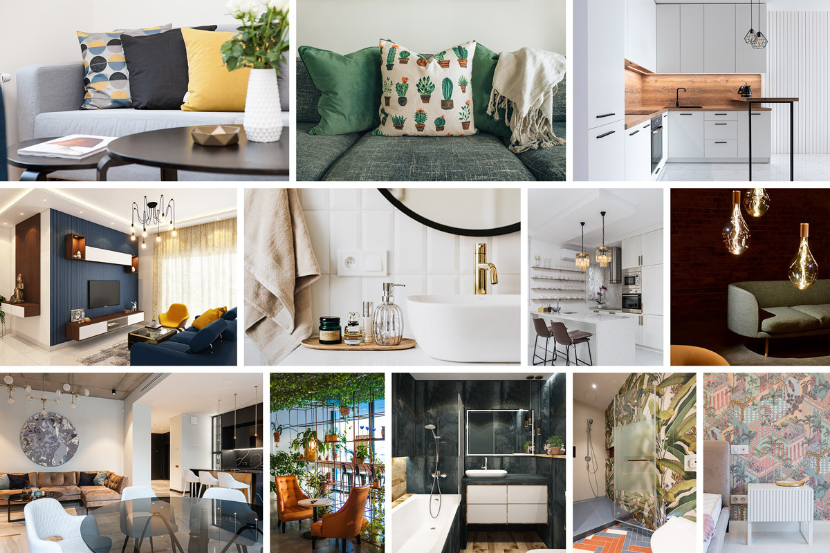
In the world of visualisation, we spend a good chunk of time trying to mimic the real world as closely as possible. So, it makes sense that we should use visual references of it wherever we can. Reference images not only help with realism, but they are also a great source for drawing inspiration. They allow you to learn from other designers - how they combine their ideas, design styles, colours and materials.
You can seek out inspiration from the world around you, if you're outside and see something you like, take a photo of it and add it to your visual library. We go into detail about places to find inspiration in this article.
Viewing materials first-hand is preferred but is often impractical, so photos make a good substitute.
The easiest way to collect photographic references is by browsing the internet and saving the designs you like into a visual library. Then when you start working on a new scene, you will have a collection of images to browse through for inspiration. For example, you could check on popular colour schemes for modern interiors or whether a darker or lighter wood is more suitable for traditional designs.
Websites like Divisare and Archdaily are great! They feature portfolios of international designers, photographers, images from specific projects, places, materials, countries and more.
As a 3D artist, it can be very easy to fall into a trap, using similar references and design ideas time and time again. But this can lead to repetitive, uninspired work and form a portfolio that doesn’t show off your true potential. It can be tough to constantly come up with fresh ideas, much like writers struggling with writer’s block, artist’s and interior designers have their own creative droughts.
We recommend addressing this right at the start of the project, by taking the time to plan your design out. This will help you work with more intention and avoid a design scheme that appears cobbled together. Consider who the target audience is, the story you are trying to tell them, and ask yourself:
If you are coming up with the same answers to these questions for every project, try to take a step back and look around for some inspiration. Look at other interior rendering work, photography and design schemes in the world around you.
Having a clear concept in your mind from the start forces you to ask yourself questions about the project at an early stage.
This results in an improved final result that you will likely reach faster. Think about if you are going for a walk, by planning your route and destination beforehand, you will have a smoother journey and end up exactly where you want to be. If you just step outside and walk in a random direction, you could end up anywhere.
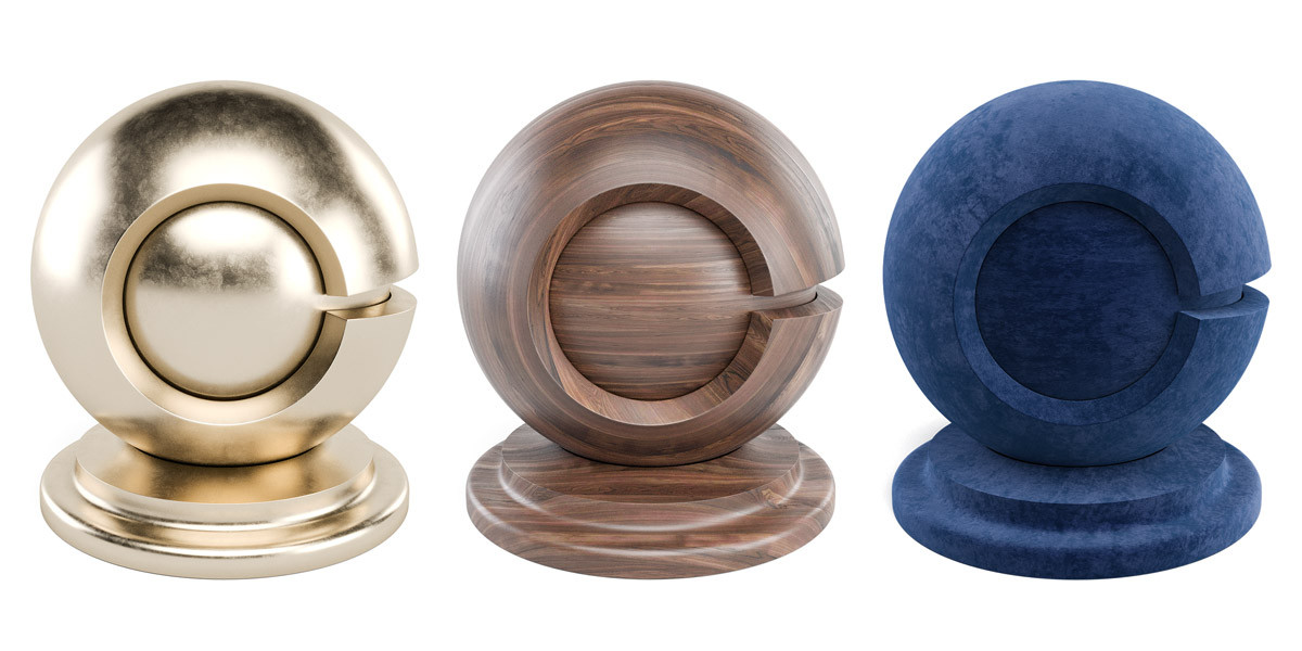
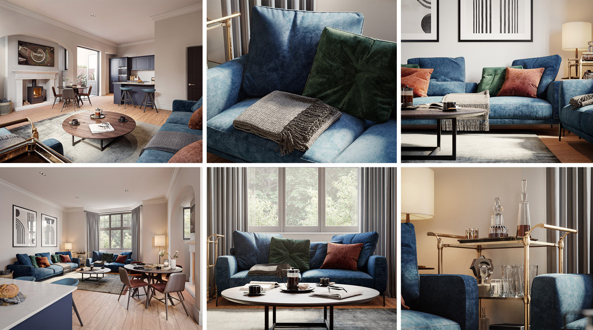
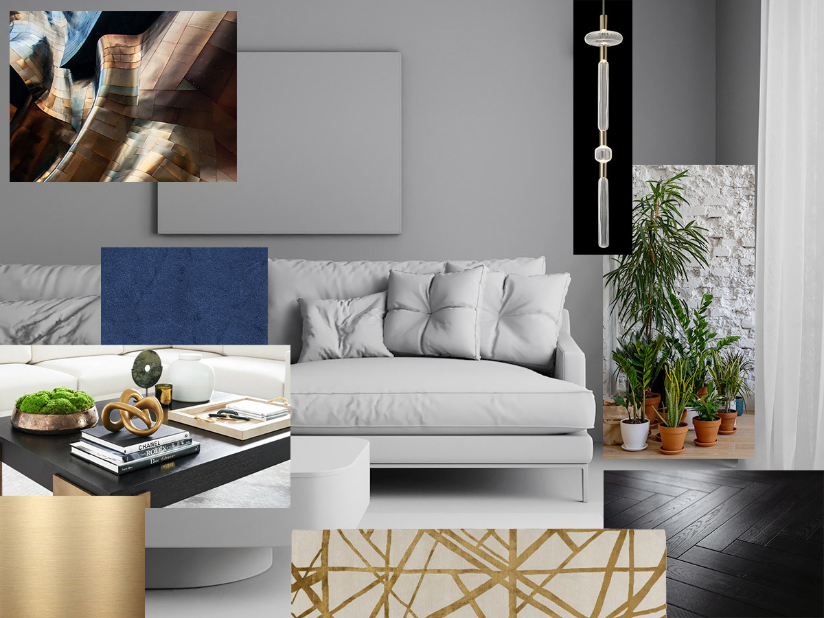
When you are working on a design scheme for an interior render, you need to dive down into the details and pay close attention to the materials. Each material has its own characteristics that can completely change the feeling of a room.
Materials like concrete can make a space look modern but on its own, it can feel cold and uninviting. Whereas textures such as fur and luxurious fabrics can add warmth and make a room feel cosy.
Think about the look that you are trying to achieve and consider the combination of materials that best fit that style. When in doubt, take a look online at similar styles, to see which materials work well together and the ones that don’t.
Lighting is an essential part of every render and vital to the interior design of a space. It sets the mood, guides the viewer's eye and highlights texture details throughout the scene. We are going to look at how to use both artificial and natural lighting to enhance your interior renders.
Artificial lights fall into these categories:
Each category has its own benefits. Think about how you can combine them to create your desired atmosphere.
Don't be afraid to show bright and darker spots, this contrast is realistic and creates added interest.
Natural environmental lighting is just as important as artificial. Different times of day will have an impact on the feel of a room, how the design is showcased and on the emotions that it evokes in the viewer. It is worth considering the purpose of the room and the story you want to tell.
You may wish to portray a dining room in the late afternoon just as dinner about to be served. During this time lots of soft and warm natural light will be pouring in. This is likely a desirable look with the lower sun producing long and soft shadows, instead of the harsh and directionless shadows present at midday.
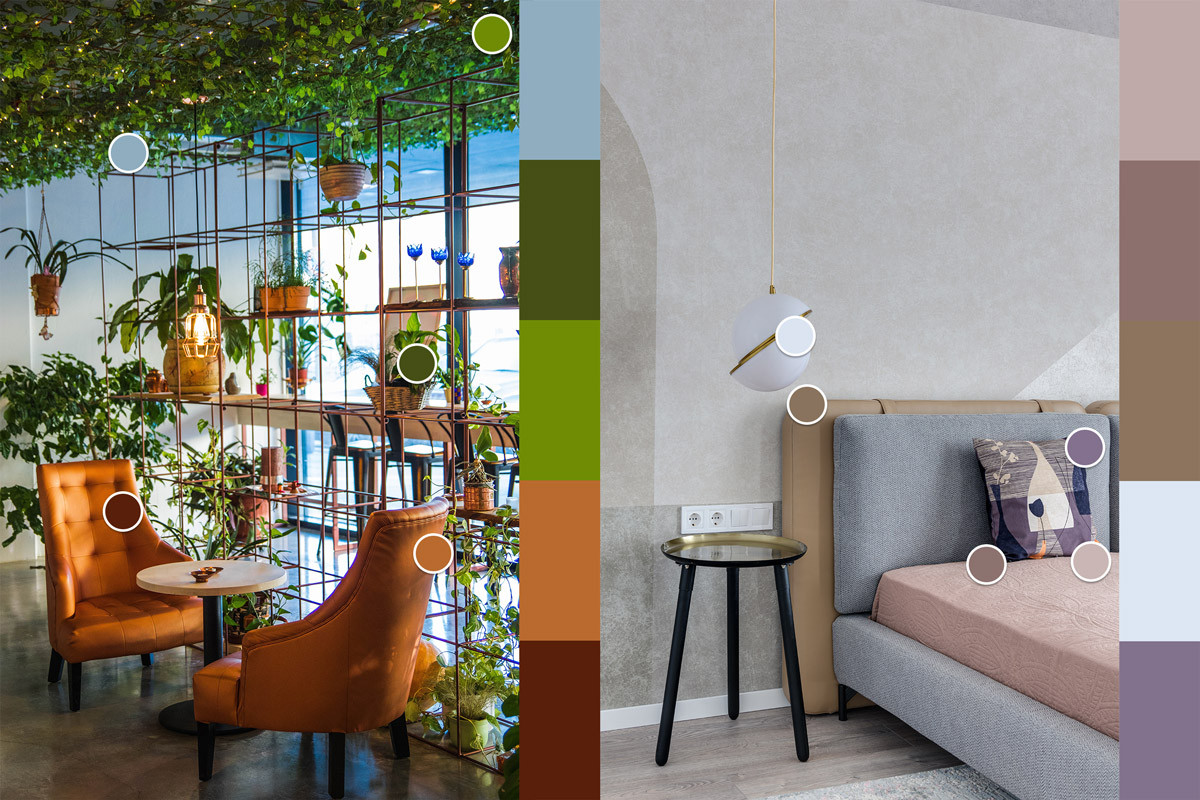
It is easy to get carried away using many different colours and materials. However, you should consider how the colours you select work together, and if they are appropriate for the space. A poorly thought-out colour scheme can cause uneasiness when looking at an interior design render.
We recommended using some basic colour theory here to ensure that colours work together harmoniously. Try following one of the options below:
The Adobe help section does a great job of briefly explaining popular colour rules.
Also consider that as humans we react to colours differently, reds and yellows, if not used sparingly, can be intense. Whereas blues and greens can have a calming effect. Similarly, according to a concept know as the biophilia hypothesis, we have a primordial connection to the natural world, and when we see natural colours, we automatically feel more relaxed.
Colours, and contrast between colours, can also be used to guide the viewer and to create focal points. A vibrant cushion or interesting pattern will draw attention to an area or piece of furniture. So keep this in mind if you want to highlight a particular part of your interior render.
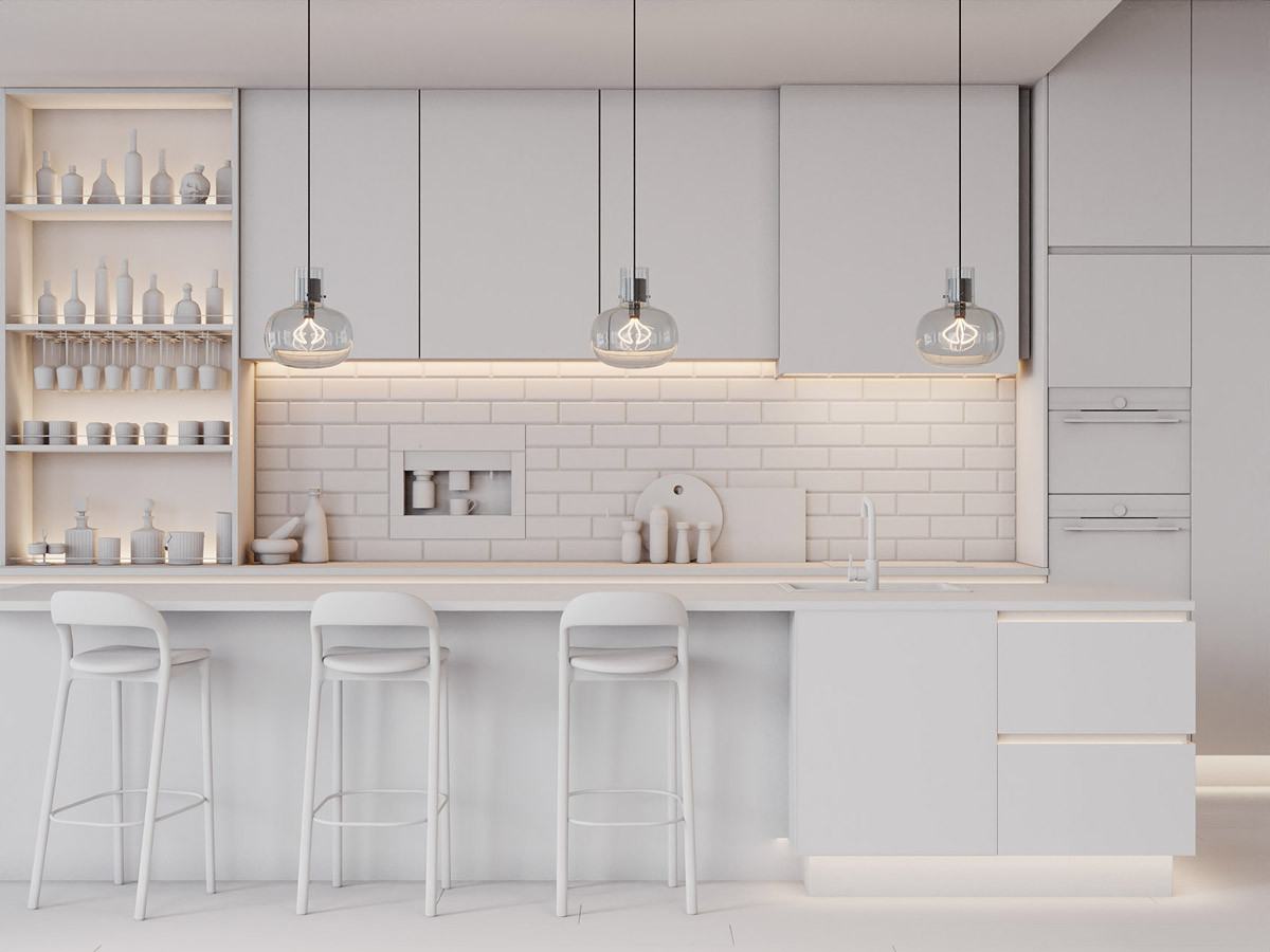
When you're new to creating interior renders and developing design schemes, we suggest keeping it simple. Try to be consistent and limit yourself to working with only one design style per interior.
If you're designing a bedroom, you may wish to stick to a traditional design, or if you're designing a kitchen you might want to opt for a more contemporary design.
By sticking to one style, you will reduce the chance of design elements “clashing”. As materials and furniture pieces will be from the same style, they will complement each other and be more appealing to the eye. Once you become more confident in interior design and develop an eye for what works, you can experiment by combining different styles in the same room for interesting results.
When you walk into someone's home or office, you'll probably notice it's filled with decorations, plants, vases, photo frames and more. Similarly, on walls, you've probably seen televisions, paintings, lights and other objects hanging there. The point is, most of the time in real life, you won't find large blank surfaces.
Therefore, when you're working on an interior render you should try to mimic this, use these spaces as an opportunity to add character to an interior. Add coffee cups, vases, flowers, or any other objects that fit within the space and strengthen the story that you are telling.
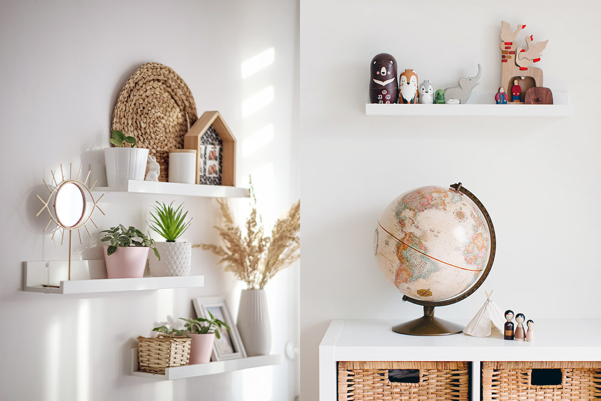
A good trick when placing objects is the rule of three.
As humans, we're attracted to objects, furniture and colours arranged into a group of 3; it feels more natural and less staged. Because of this, you may choose to add candles, photo frames or cushions in a group of three, to make your surfaces look more satisfying.
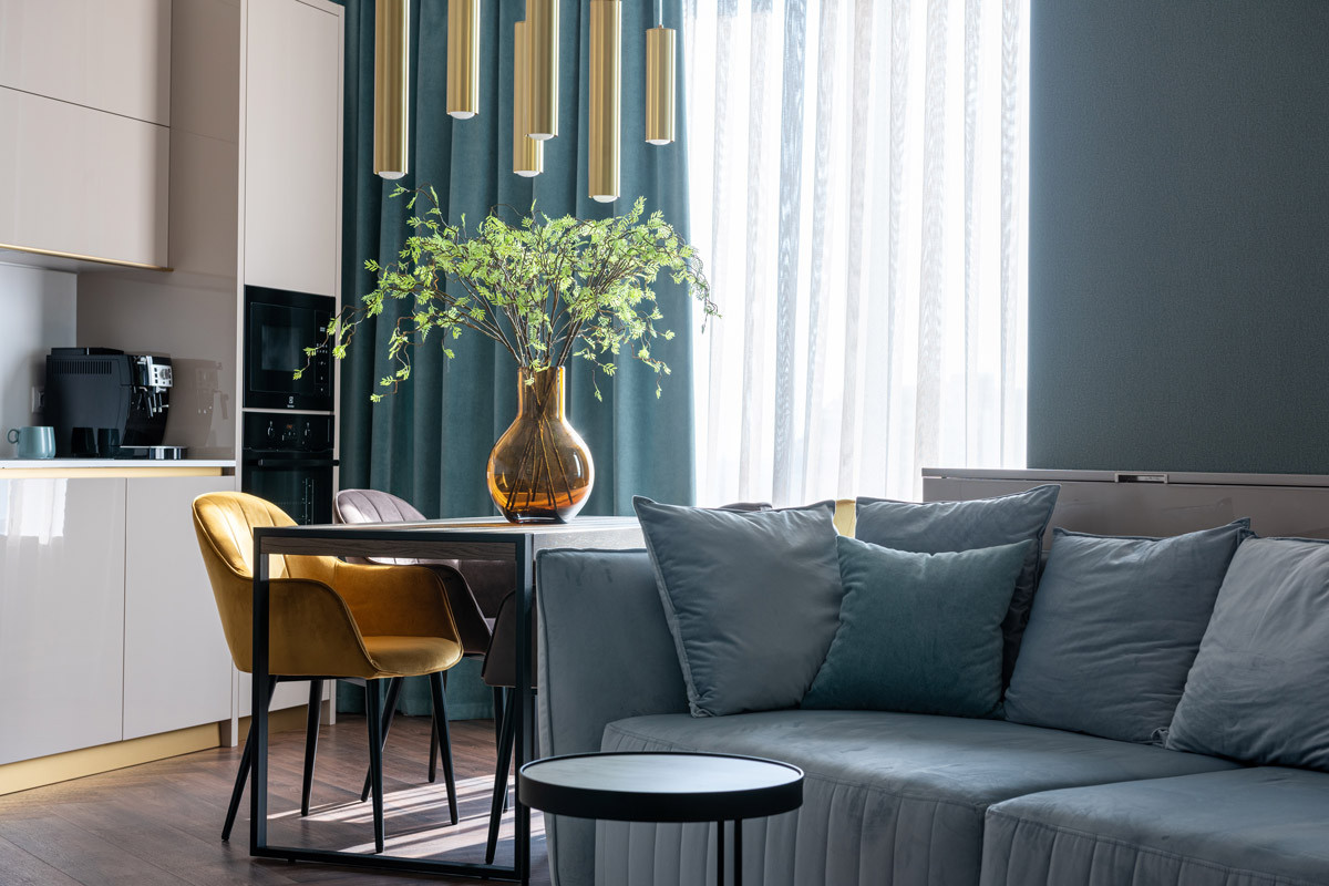
Lastly, don’t be afraid to be bold. A patterned feature wall, statement light or unique decoration can give your design personality and set it apart from every other interior render.
These next two tips are less design-focused and more general guidance but they are worth mentioning.
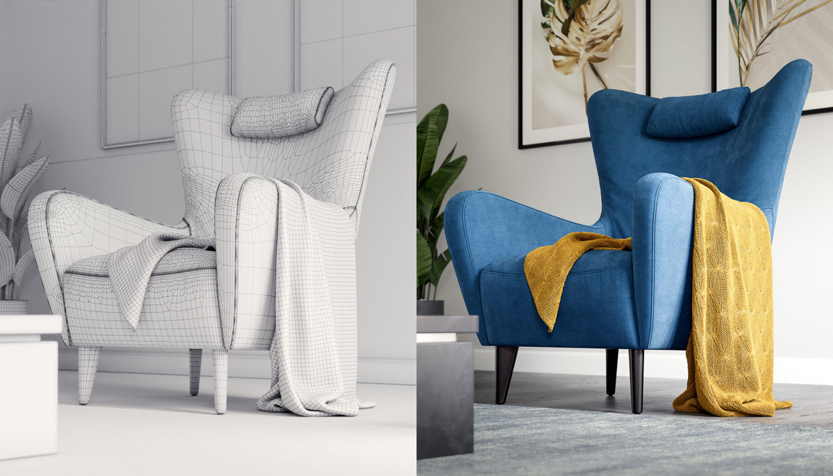
Using high-quality realistic 3D models in your interior renders is a must. Nothing makes a render look unrealistic more than an ill-proportion or low-poly model that is lacking detail. However, creating high-quality 3D furniture models from scratch is often inefficient, and require skills like sculpting that even many experienced artists are not proficient in.
The solution here is to purchase these models. There are 3D marketplaces with huge libraries full of furniture and decorations from all of the popular interior design brands. Two of our favourite websites are Dimensiva and 3dSky they both have incredible 3D models available for very reasonable prices.
By doing this you can progress your interior renders much faster and produce better quality work.

Placing a wide-angled camera in the corner or a room is scarcely the best choice to visualise a space or the details of the interior design. It may show the entire room but renders such as these often suffer from poor composition, a weak focal point and a lack of purpose.
Play around with the camera height, position, focal length and composition to come up with some new ideas. Try to focus on different parts of your design, if you’ve followed our previous tips you will have some amazing details that you will want to show off, drawing attention to the details is the perfect way to show off your design.
These detailed shots are often referred to as vignettes, they are a powerful way of conveying a message or feeling. We give some useful tips on creating vignettes in another article.
More than anything else on this list it is important to try different ideas out. Some will work and others won’t but going through this process will improve your knowledge. You will learn more about the design styles that you like and the ones you don’t, about your favourite colour combinations and the best lighting setups to show them off.
Even if you have a design completely planned out, you will still likely want to make adjustments and improvements as you progress - and that is completely fine, it is part of the creative process.
Many beginners to interior rendering are often too eager to create something that they skip the basics of interior design and other neighbouring artistic subjects. Whether you're working on behalf of a client or yourself, you must understand it is important to be familiar with the basics.
Once you have an idea, you can gather reference images to help compose a visual library that inspires your interior renders. Select design elements and colours that complement each other but also understand the dramatic impact that lighting has on the mood of an interior render and how the design is portrayed.
It is important to consider how humans perceive different elements so keep the rule of three, composition rules and colours harmonies in mind throughout the design process. But remember why you got into 3D rendering, I’m sure it wasn’t for the rules, so experiment, try different things and have fun with it!
If you are interested in finding out more and the interior renders we produce at Curved Axis - check out our interior rendering services or our portfolio.
Let us know what you think! Would you like to see more content like this? Or have you got a question for us? Either way, we look forward to hearing your thoughts and continuing the discussion.
Alternatively, if you want to talk about career opportunities, discuss an upcoming project, or just say hi, we would love to hear from you too!