21st May 2021
Creating an interior design portfolio, whether it’s for a potential employer or prospective client, can be a daunting task! You can find yourself spending days and days looking for inspiration from other portfolios and designers. But in the end, you need a theme and composition that represents you and your work in a sophisticated manner.
There’s a saying “a good designer who’s bad at sales won’t be as successful as a bad designer who’s good at sales''. If a designer cannot sell their skills to potential clients then they’ll be losing out on work. Furthermore, they’ll most likely be losing out to someone who has effectively showcased their brand.
While this article looks at interior design portfolios, the tips focus on the presentation and provide general design guidance that is transferable to any type of visual portfolio.
Here are 8 tips to ensure your design work stands out!
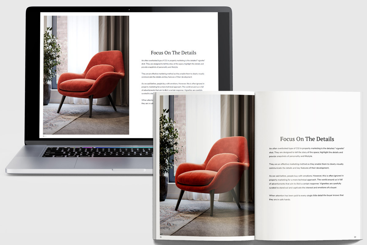
A portfolio is all about displaying your work in the most effective way. The first thing to decide upon is the display format, whether you display it digitally or physically. The ideal situation is to create both, that is what we do, as it caters to a wider range of clients and scenarios.
You will probably notice that some people prefer to have something tangible, they love the look and feel of designs shown on paper. Whereas others opt for a digital format as they prefer convenience and portability. Busy clients can view your portfolio on the go, for example on their commute to work, or quickly forward it on to colleagues.
With this in mind, you will need to ensure that your digital portfolio is as clear on a laptop as it is on a tablet or mobile. If you have any links in the digital version replace them with QR codes on the physical version.
The flexibility of having both allows you to easily submit it to a wide audience and then have the impact of the printed version for in-person meetings. High-quality physical versions will also likely be kept by clients in their offices and potentially used as a reference in the future.
So how do digital interior design portfolios compare to physical portfolios?
Digital portfolios
✔️ Convenient and quick to access
✔️ Can be easily created and distributed
✔️ Portable
✔️ Low cost
Physical portfolios
✔️ Stronger impact
✔️ Higher production value
✔️ Gives the client something tangible
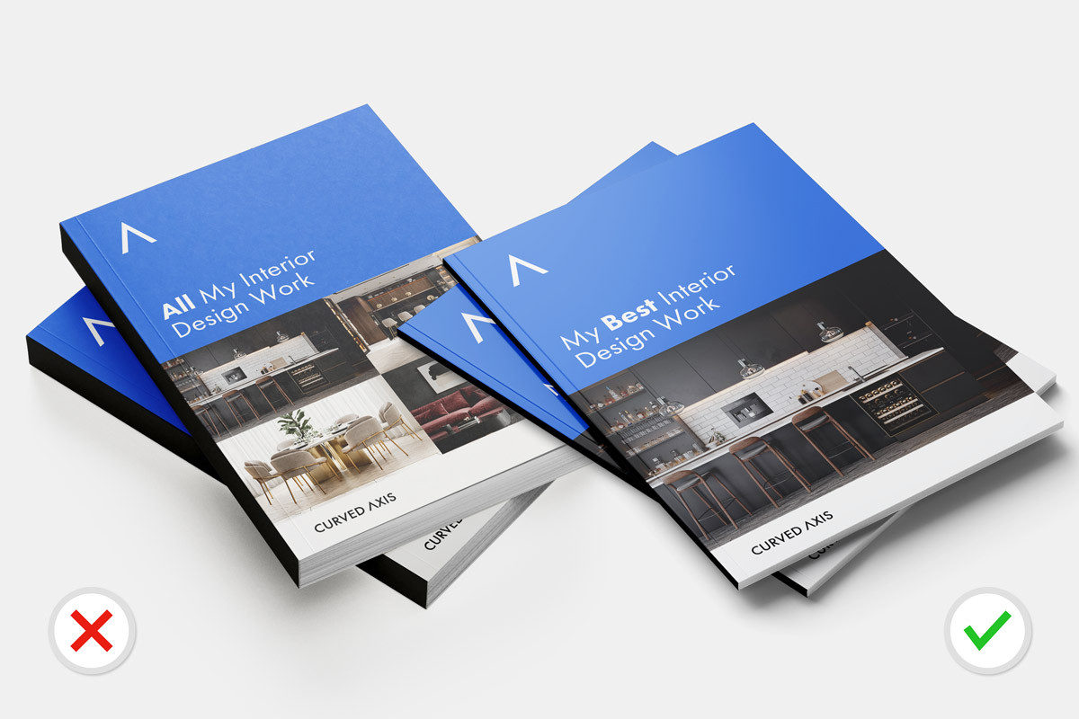
This is true for any portfolio - you want the client to see the best of your interior design skills. Think of your portfolio as the answers to interview questions. In an interview, you don’t tell the recruiter absolutely everything you’ve done, you highlight your most successful and relevant achievements in order to show yourself in the best light. This is what you want to do here, by only showing your best work.
The client isn’t looking at your profile to see how many projects you have completed. They want to see your skills and the type of work you can create for them. Therefore, show them quality over quantity!
Furthermore, if your client is time-poor or receives many design portfolios, they will want to see your abilities in a snapshot. So, use their time wisely, captivate them and showcase your most impressive achievements!
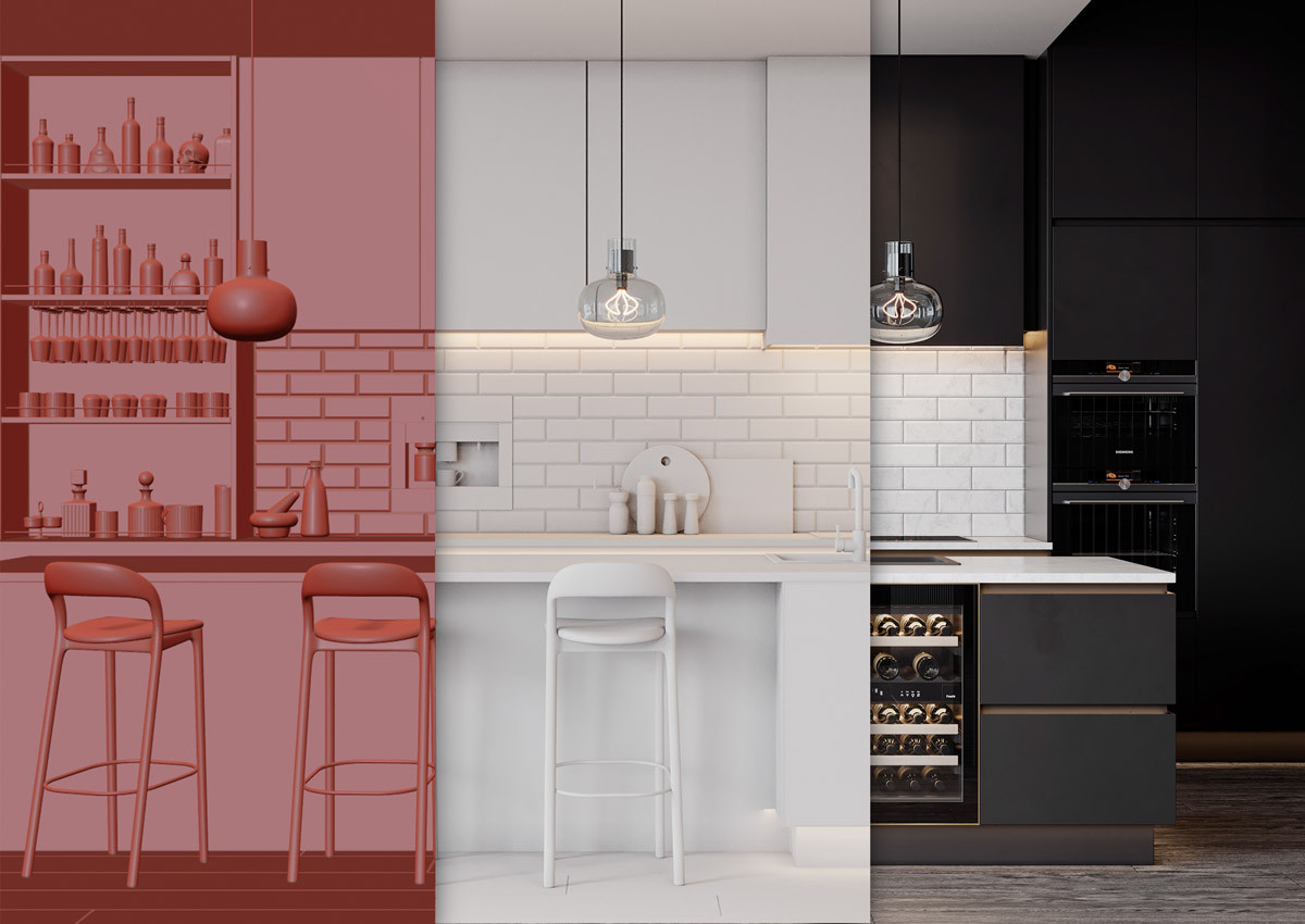
Within your portfolio, you should include the creative journey taken to come up with your final designs. You can do this for each project, or only show it for one project - that’s your choice. The artistic skills you show them will broaden their insight into your idea development as well as the method behind each project.
However, there are some things that you should leave out of your portfolio. Too many technical drawings and CAD plans can be overwhelming, and boring. So, it’s a good idea to use these sparingly. When you do include them, try to add some colours or textures to make them more engaging.
To showcase your design journey:
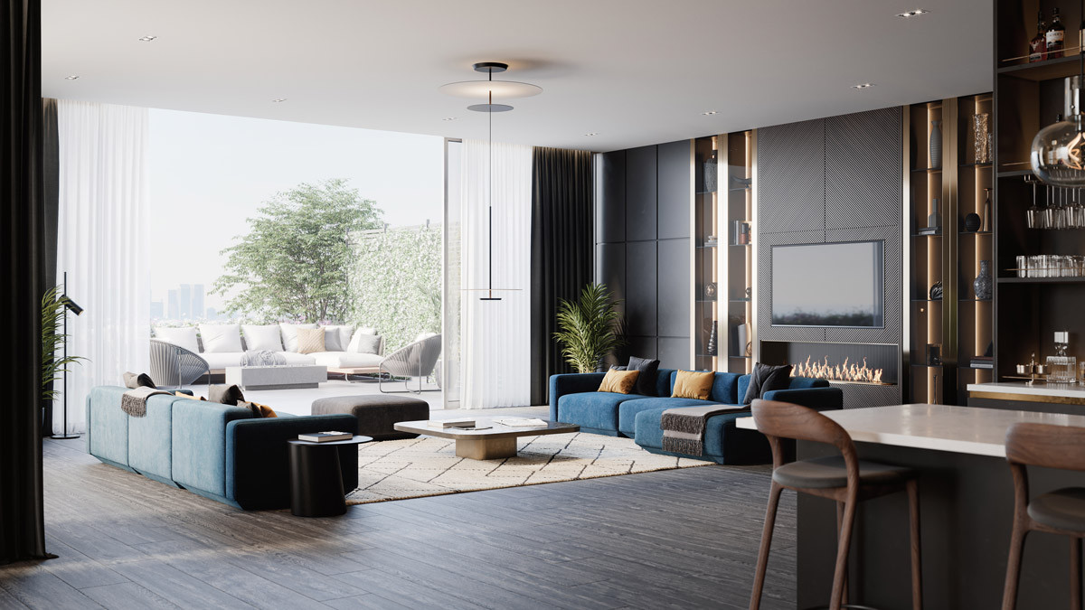
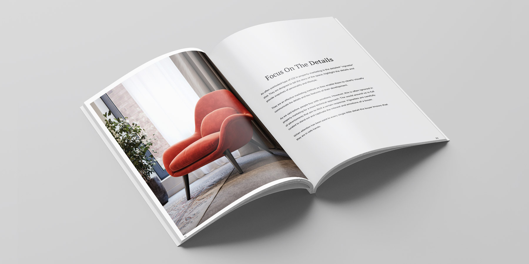
For each project that you show within your portfolio, you need to “wow” potential clients. High-quality photographs and CGI renders are a perfect way to do this. Not only do they look professional but they will also enable you to display your interior design accomplishments clearly.
If a project isn’t completed yet, you can use a CGI render to visualise the design instead of the final photographs. Since interior renders can be photo-realistic visuals of a proposed design. They’re highly detailed and are an incredibly useful way to portray your ideas. You can find out more about our interior rendering services here.
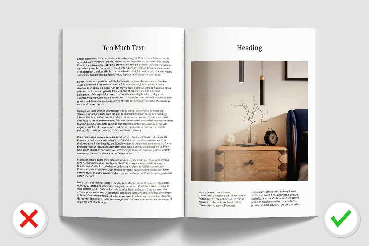
Although you may want to write various paragraphs that explain your work in detail, it’s best to let the visuals speak for themselves. Most of the time, whoever is viewing your portfolio will skip over large chunks of text. Interior design is, after all, a visual industry where the look and feel of a design paints a story. You shouldn’t need large bodies of text to narrate the scene.
Of course, you can write a few lines of accompanying text. But keep it short and to the point. Furthermore, if you feel you need to include text, make sure it is written to make an impact. The text should help to represent your work in the best light. Short paragraphs, bullet points and narrow formatted text all increase readability.
It can be easy to get carried away when writing text to go with your project. But remember - be concise and use text sparingly!
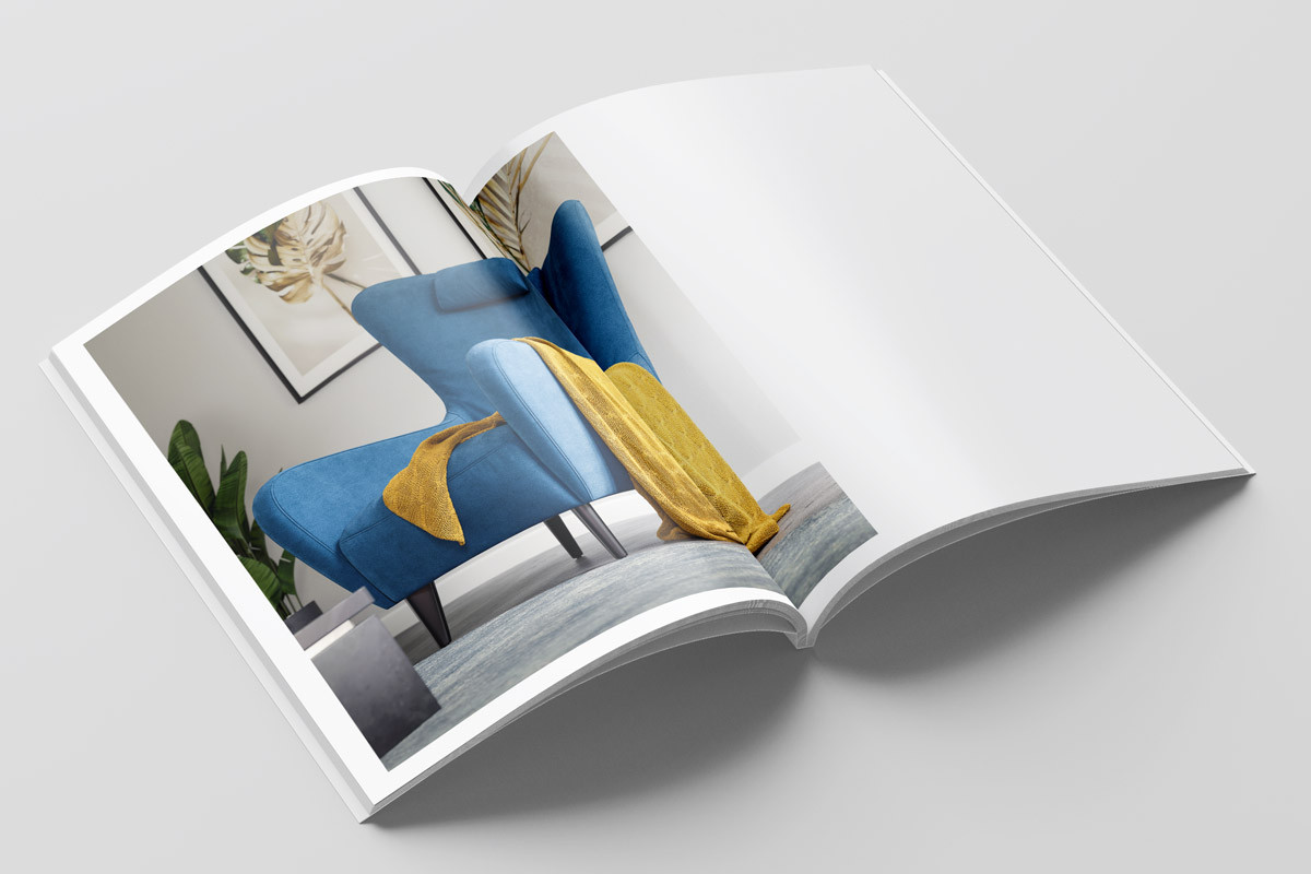
White space is a powerful way to effectively showcase your work. A good example of this is websites that use a lot of white space. The white background (with thoughtfully placed imagery and text) guides the viewer through the webpage to keep them engaged. Therefore, their eyes go on a captivating journey from the top to the bottom of the page. Thus, they’ll quickly absorb the information they need, compared to a cluttered web page which feels more like “Where’s Wally”!
It’s the same principle with your interior design portfolio.
By including sufficient “breathing space” around each image, piece of text, or sketch, you’ll create a layout that effortlessly flows. White pages that only have a heading with a few lines of text can help strengthen the impact of surrounding pages. Alternatively, don’t be afraid to leave entire pages empty. Space gives your viewer’s eyes a chance to rest and briefly contemplate what they were looking at.
To emphasise, white space is one of the most important aspects. It will enable you to intentionally highlight your best work and take the viewer on a clear, enjoyable, visual journey.
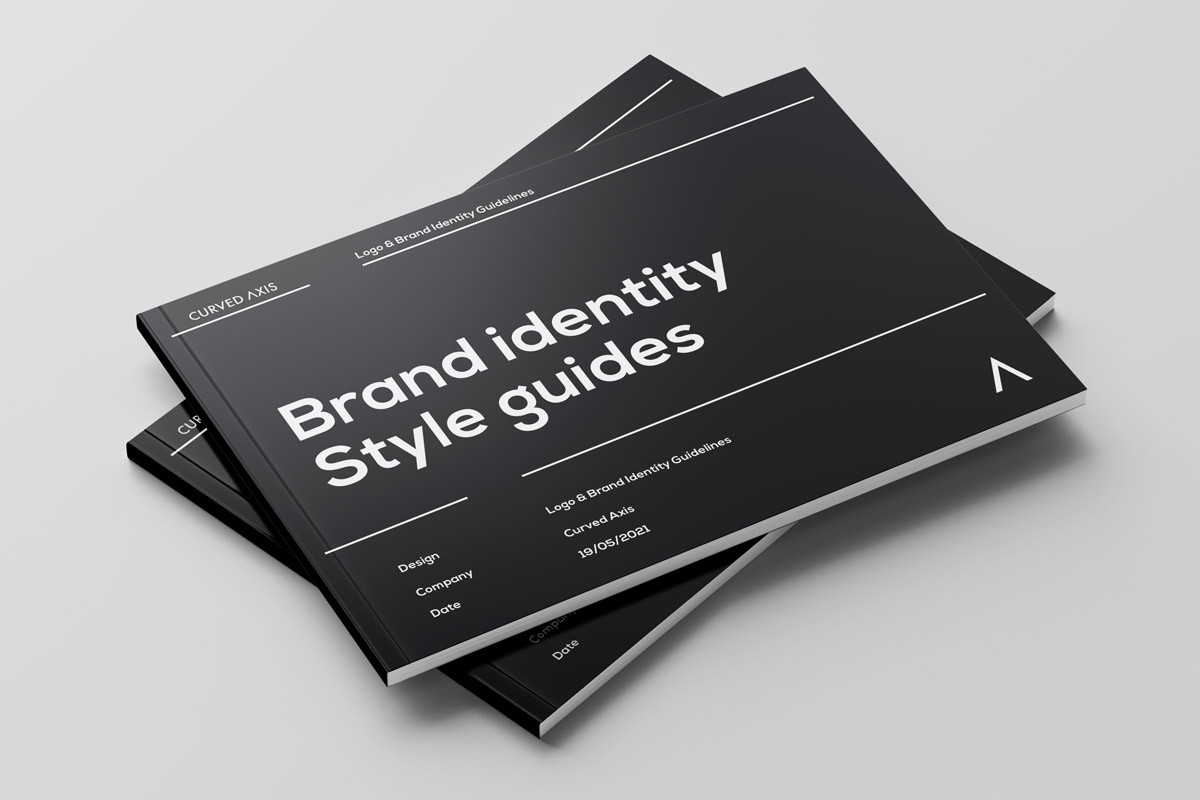
Have you noticed that every leading brand has an established set of brand guidelines? Google have an entire resource centre dedicated to it. There is good reason why they invest so much time and money into this. These guidelines clearly lay out the tone, message, and voice that they want to be consistently associated with. It highlights who they are and their values.
The keyword here is consistency. You need to be consistent in order to build a recognisable tone of voice for your brand (you being the brand in this case). Your “brand”, alongside your work, is what you’ll be remembered by. Furthermore, it will help you build up recognition in the interior design industry.
So, you need to think carefully about a theme, as ideally, you should embrace this theme and continue using it for future portfolios. Find a style that you like. One that will compliment your work and compliment you as a designer. Then commit to it! For example, if your work style is contemporary and minimalist, but uses occasional splashes of colour, reflect this within your theme.
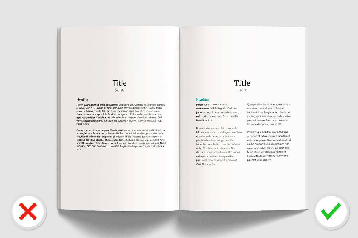
Following on from choosing the right theme for your work, typography also plays a huge role in this. You can continue the theme of your work through the type - a minimalist interior style will work harmoniously with a minimalist modern san-serif typography style.
If typography is done the right way, it has the ability to elevate your design and subconsciously guide the viewer. Good type will create a strong visual hierarchy and will contribute to setting the flow of your portfolio. It’s essentially the body language of your displayed work.
It sets the tone of voice and enhances the theme of your work. Here are some important “Do’s and Dont’s” to keep in mind:
The Uber branding guidelines has a section that covers typography which gives an insight into what big businesses allow and what they find unacceptable with text. The clean sans-serif font they use is in line with the image they want to portray - a modern and innovative company. But I think it lacks personality, something you want to avoid in your design portfolio!
The soulless sans-serif branding trend is something that you can blame the popularisation of fonts like Helvetica and Futura for, which are well enough known to have an entire documentary made and book written about them, respectively. As you scan this article and glance to the top-left corner of the page, you'll probably realise that we are not in a position to be critical on this subject without sounding hypocritical, so we will leave it there.
A successful interior design portfolio includes your design processes, impressive visuals, a clear brand message, and finally your best work! If you take on board our top 8 tips for your portfolio then you’ll have all the tools to stand out from the competition.
Above all, your portfolio needs to be a visual delight, whether it’s digital or physical. So, keep this in mind while you’re designing it. Each aspect is equally as important as the others and all work harmoniously together to beautifully showcase your work.
If you are looking for some stunning interior renders to make your portfolio stand out, check out our interior rendering services.
Let us know what you think! Would you like to see more content like this? Or have you got a question for us? Either way, we look forward to hearing your thoughts and continuing the discussion.
Alternatively, if you want to talk about career opportunities, discuss an upcoming project, or just say hi, we would love to hear from you too!